1) Car steering wheel/gas pedals
2) Stove dials
3) Elevator buttons
4) Handles on a sink faucet, or sensors on some sinks
5) Door handles
6) Handle bars and pedals of a bike
7) Desk chair adjustments
8) Treadmill settings and options
9) Shower head adjustments for strength and spread of water
10) Light switches
Good interface between player and game:
Skyrim


Skyrim has a very simple but effective interface. It only presents what is relevant, and it leaves most of the screen visible. Most of the time, health, stamina, and magic bars aren't present unless they're not at full. The compass at the top is fairly good to be a simple way to quickly see what's in the environment without having a map taking up a corner of the screen.
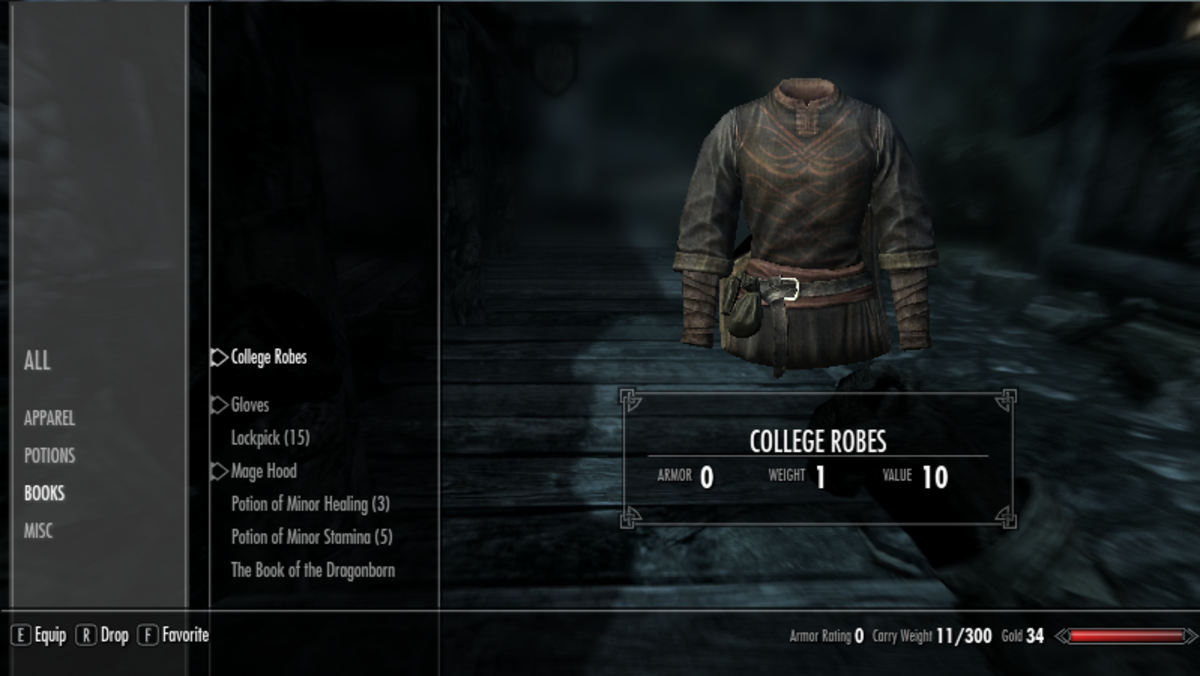
The interface with inventory is also very simple and easy to understand. You can clearly see the objects and pertinent information to them which allows you to make easy judgments about what to hold on to or get rid of. The shops are set up in a similar way, clearly marking what is part of the shop keeper's inventory for you to buy, and what's a part of yours for you to sell.

The dialogue options are fairly straightforward as well, highlighting what's selected and showing you what you have and haven't said. The only thing that can be a bit confusing at times is what's a list of dialogue you can just go through and what's a choice that won't go back to the same options and questions. Other than that, though, the interfaces they use are easy to understand and very simple and clean-looking.
Bad interface between player and game:
This is where I'm kind of struggling. Most of the games I've played haven't really been bad games, and so it's hard for me to say what really is bad. The closest thing I can think of is a game that mostly just had an interface you had to get used to. So, here's Long Live the Queen.


This is where about half the game takes place. You select classes to increase various skills, and it later affects what happens in the story based on those stats. There's a lot of information between the two, and it takes some getting used to in order to understand what's going on. You also have to go back and forth between a lot of the screens, which can be a bit annoying. I'm not sure how else you might present this, though. The only thing I could think of is allowing something more side-by-side, or being able to sort or search through the categories so there isn't so much going on at once.

This is the mood meter, and it's another fairly important aspect to the game. Depending on Elodie's mood, her performance is affected one way or the other. The issue with this is more of a mechanic thing than an interface one, though. People are usually inclined to try and make her cheerful and level out her mood based on how this is laid out, but really the strategy that should be implemented is very different. It is only stated once about how these feelings affect one another, but it's very vital to understand in order to play the game right and eventually succeed.
No comments:
Post a Comment